
 Business Apps·11 August 2026·10 min read
 The old grid is deprecated — what the Power Apps grid control does better
“Why does this view suddenly look different — and why is there a red banner over my grid in the docs?” If you build model-driven apps, that’s a fair question right now. In March 2026 Microsoft deprecated two familiar grids at once — the classic Editable Grid and the Power Apps Read-Only Grid — and pushes everything onto one successor: the Power Apps grid control.
This isn’t cosmetics. It’s the move to one modern grid for viewing and editing. Before you migrate, you have to keep three similar-sounding names apart — otherwise you configure the wrong thing. One at a time.
The problem: three grids that are named almost the same
This is exactly where most people get lost. The docs list three controls whose names barely differ:
| Name | What it is | Status (Aug 2026) |
|---|---|---|
| Power Apps grid control | the new grid — read-only and editable | active, recommended |
| Power Apps Read-Only Grid control | interim solution from 2021/22 — view only | deprecated (March 2026) |
| Editable Grid (classic) | the old editable grid | deprecated (March 2026) |
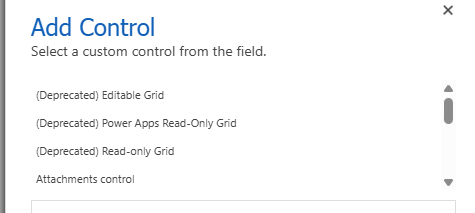
Even the doc URLs are a trap: .../the-power-apps-grid-control (with “the-”) is the new control, .../power-apps-grid-control is the deprecated Read-Only Grid. Read the wrong page and you configure past the successor.
And the deprecation is real, but often misread. Verbatim from the official announcement: the old grids “continue to function until further notice, after which they are no longer supported. These controls will receive critical security fixes only and no new features.” So: not switched off, but frozen — no new features, eventually no support. Microsoft gives no concrete shutdown date.
What the Power Apps grid control is
The new control is the next evolution of the read-only grid — and replaces both predecessors with one grid. From the maker docs: “This singular grid control can be utilized for read-only or edit scenarios.”
The core difference from the old ones:
- It’s built on modern Fluent controls and meets the current accessibility standards. The old Editable Grid, per Microsoft, rests on an architecture “that does not align with current Microsoft accessibility standards and has limited extensibility”.
- It does everything you used to choose between read-only and editable for — in one control, configured per view/subgrid.
Microsoft states the direction plainly: this control “eventually replaces all read-only and editable grids in model-driven apps.”
What actually happens (technically and day to day)
Three things to know before you start:
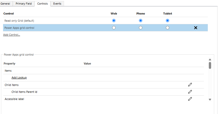
- The new grid isn’t editable by default. This is the most common stumble. Verbatim: “By default, when you add the Power Apps grid control to a subgrid it isn’t editable. You must configure the control.” The switch is the Enable editing property — default No. Add the control alone and you still get a view-only grid.
- Deprecation ≠ migration happens by itself. There is no announced forced switch of existing apps. The docs are clear: “Makers who have configured apps to use the Editable Grid or Power Apps Read-Only Grid controls need to transition to the Power Apps grid control.” That’s manual work — you have to find affected apps and switch them.
- The old admin toggle only concerns the Read-Only Grid. In the Power Platform Admin Center, under Environments → Settings → Product → Features → Grids and views, there’s the switch “Enable the modern read-only grid experience” (the opt-out of the 2022 auto-switch). Per the docs this toggle will “eventually be removed” with the deprecation — it’s not the path to the new control.
From these three points it follows directly which reflexes go wrong here.
The obvious but wrong reflexes
Reflex 1: “I swap the control and get an editable grid.” No — without Enable editing = Yes it stays read-only. Adding the control alone doesn’t change editability.
Reflex 2: “From March 2026 the old grid stops working, I must switch everything now.” Also no. Deprecated means frozen, not switched off — “until further notice”. You have time for a clean, tested migration. But: no new features and eventually no support — kicking it down the road isn’t a strategy.
Reflex 3: “‘Power Apps grid control’ is the Read-Only Grid, right?” The naming trap. The Power Apps grid control is the successor; the Power Apps Read-Only Grid control is the deprecated interim thing. Watch for the “the-” in the URL and the deprecation banner on the page.
The robust path: set it up and migrate
Where you add the control
The Power Apps grid control can be set at three levels:
- A subgrid on a form — in the modern form designer: Solutions → table → Forms → main form, select the subgrid, under Components pick the Power Apps grid control, configure, Save & Publish.
- All views of a table — in the classic solution explorer: Entities → table → Controls tab → Add control → Power Apps grid control. This then applies to all views of the table.
- A single subgrid in the classic solution explorer — open the form, subgrid → Change properties → Controls → Add control.
The properties that matter
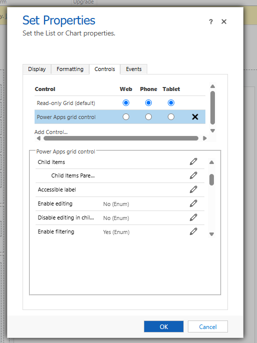
Configuration happens via control properties. The practically relevant ones:
- Enable editing (default No) — the central switch: read-only vs. editable.
- Enable pagination (default No) — No = infinite scroll, Yes = classic page buttons (turns off infinite scroll; “Select all” is then missing under infinite scroll).
- Enable filtering / Enable sorting (both Yes) — filter and sort via the column-header dropdowns.
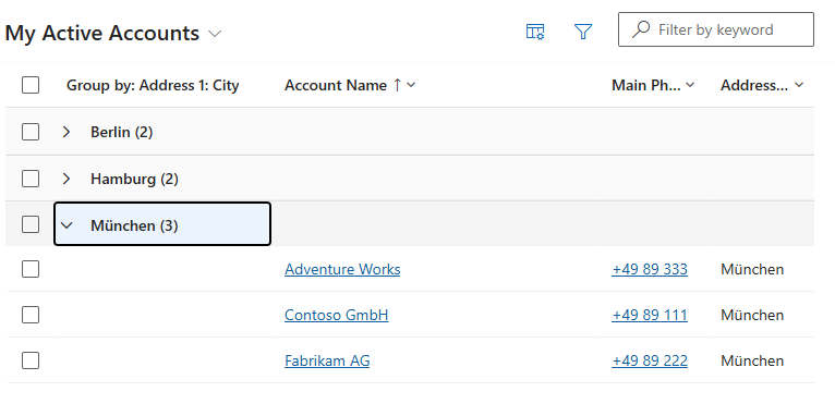
- Enable grouping / Enable aggregation (both No) — group by a column, or sum/min/max/average per numeric column. (Grouping not with paging enabled and not for lookup columns.)
- Allow column reordering (default No) — reorder columns by drag-and-drop (the Read-Only Grid couldn’t do this at all).
- Reflow behavior (default Reflow) — table, list, or automatic by width → the grid becomes mobile/responsive.
- Nested grid: Child items (entity + view) and Child items parent ID (the linking relationship column) — a row expands to show related records; on the web, not just phone/tablet like the old grid.
Extending cells — the customizer (PCF)
If the built-in cells aren’t enough, you extend them via a grid customizer control — a PCF code component that implements the grid’s customizer interface. It provides, per data type, a React element for display (cell renderer) and editing (cell editor).
- Template:
GridCustomizerControlTemplatein the officialmicrosoft/PowerApps-Samplesrepo; the core files areCellRendererOverrides.tsxandCellEditorOverrides.tsx(mapping data type → React element; returnnulland the grid uses its internal renderer). - Ship it like any PCF: package and import, or
pac pcf push, then set the Customizer control property in the table’s Controls to the logical name. - Limit: exactly one customizer per grid. And: renderers/editors are pure UI — no data mutation, no effect on server-side filtering/sorting.
If you already build PCF components in VS Code, the matching tooling context is in Dataverse Custom API Toolkit.
The benefits at a glance
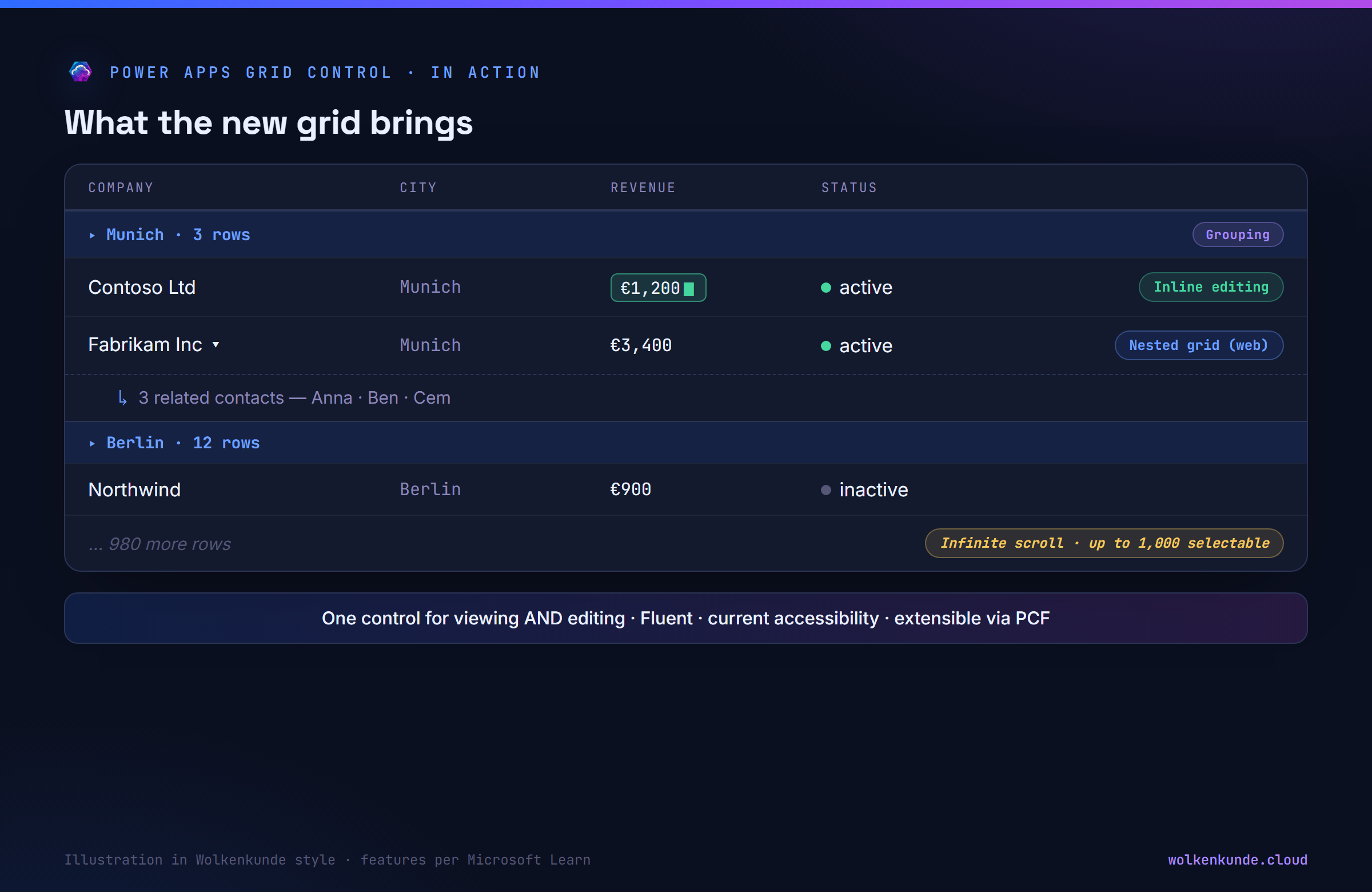
- One control for read-only and editable — no switching between two grids.
- Infinite scroll instead of paging; up to 1,000 rows selectable at once for bulk actions.
- Inline editing right in the view (when enabled).
- Nested grids on the web — expand related records, multiple rows at once.
- Grouping and aggregation, filter/sort, column reordering.
- Reflow/card-list for mobile, OptionSet colors, status and data-type icons, jump bar, range select (copy to Excel).
- Accessibility to the current standard and extensibility via the PCF customizer.
The honest limits
No marketing — what the new grid (still) can’t do, per the docs:
- Card/list view (narrow/mobile): no sorting, no “Select all”, no jump bar, no images (initials only); custom cards aren’t shown.
- In editable mode: lookup cells can’t be customized (“lookup field cell customization options aren’t supported”).
- Grouping not with paging enabled and not for lookup columns.
- No legacy theme customizations; empty cells stay blank instead of ”---”; the owner column shows no online status/people card.
- Lookup filters (Equals/Does not equal) only show options from the currently filtered set — a behavior difference from the old grid worth testing on migration.
Migration checklist
- Find affected apps/views — where do Editable Grid or Read-Only Grid run today?
- Set the Power Apps grid control per view/subgrid (table Controls for all views, or targeted on the subgrid).
- Set Enable editing deliberately — otherwise read-only stays read-only.
- Decide infinite scroll vs. paging (grouping needs paging off).
- Enable nested grids / grouping / aggregation where they add value.
- Need custom cells? Then a PCF customizer (one per grid).
- Test before publishing — especially lookup filters, card view and editable lookups.
In short: the Power Apps grid control is the overdue, modern successor — one grid for viewing and editing, with infinite scroll, nested grids and PCF extensibility. The deprecation of the old grids (March 2026) forces nothing immediately but freezes them. The right path is a calm, tested migration: set the control, decide Enable editing deliberately, check the limits (card view, editable lookups) up front — instead of running into a frozen legacy grid at the first feature request.
State: August 2026. The editable Power Apps grid control ran as a public preview from June 2022; the current Learn docs list it without a preview label as the recommended default control, but state no dated GA — when in doubt, check the linked Learn pages.
Official sources
- Power Apps grid control (the new control) — definition, features, all properties, setup, limits.
- Important changes (deprecations) coming in Power Platform — section “Deprecation of Editable Grid and Power Apps Read-Only Grid controls” (March 2026).
- Power Apps Read-Only Grid control (deprecated) — deprecation banner, admin toggle.
- Editable Grid (classic, deprecated) — deprecation banner, support matrix.
- Customize cells with the grid customizer control (PCF) — cell renderer/editor, customizer.